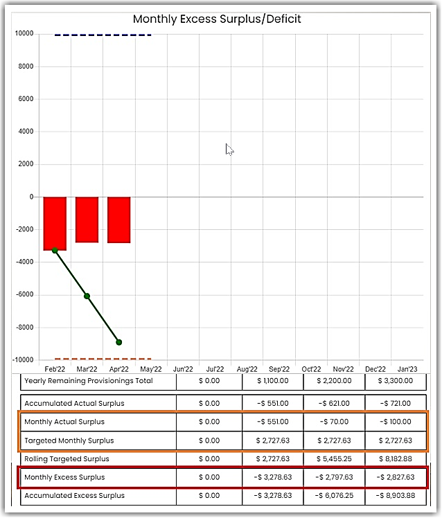
The data in this chart is derived from the Provisions Jar and Primary Account – Savings on the MoneySMARTS page.
If you’re keen to finding out how this is computed:
- On the MoneySMARTS Dashboard, look for the “Provisions Jar” and click on it.
- Scroll down and you’ll see the amount in “Total Provision Balance” row.
- Divide the total amount to 12 months to get your monthly allocated provision.
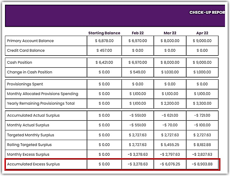
- The Change in Cash Position is the change in your Monthly Check-up as compared to the previous month.
- The Monthly Actual Surplus is the difference between the Monthly Provision and the Change in Cash Position.
- The Bar in the Monthly Excess Surplus/Deficit chart is the difference between the Monthly Actual Surplus and the Targeted Monthly Surplus.
- The Line in the Monthly Excess Surplus/Deficit chart is basically the accumulated amount of the bar graph. See screenshots below.
- The broken lines represent the Saving and Spending flags. It is calculated by (Total Money Out − Total Provisions Spending ÷ 12).
- Savings flag is simply the inverse value of the Spending flag


👉 To learn more about how to implement MoneySMARTS, click here.


